Create interactive UI
Learn how to build interactive UI and connect stateful scripts to power it.
A HUD (Heads-Up Display) in your game commonly displays non‑interactive UI elements such as the health meter demonstrated in Create HUD meters. Atop this, almost every game requires interactive UI such as buttons that respond to player activation, animate when activated, tween in/out menus with other interactive controls, etc.
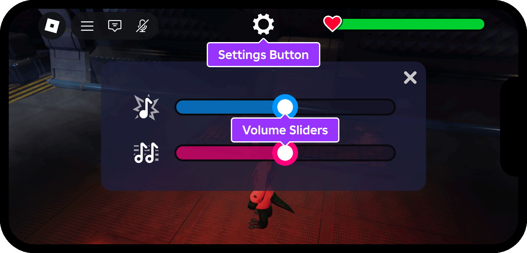
Using UI Fundamentals - HUD Meter as a starting place and UI Fundamentals - Interactivity as a finished reference place, this tutorial demonstrates:
- How to position a settings button along the top screen edge.
- Design of a settings menu containing interactive draggable sliders.
- Usage of a
ModuleScriptsto form "controller" modules for extensible control of UI objects with stateful declarations. - How to connect buttons to player activation to toggle in/out the settings menu.
- How to connect draggable UI sliders to adjust the volume of sound effects and background ambience separately.
Enable the Device Emulator#
As noted in Create HUD meters, phones and tablets have the least amount of screen space, so it's important that your UI elements fit on smaller screens and that they're clearly visible to players. If you haven't done so already, enable the Device Emulator in Studio:
- Open the UI Fundamentals - HUD Meter template in Studio.
From Studio's Test menu, toggle on Device Emulator.
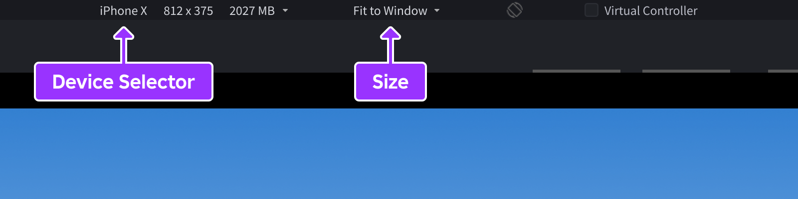
From the bar directly above the main viewport, select a phone emulation such as iPhone X or Samsung Galaxy A51. Then, set the view size to Fit to Window to utilize the maximum space in Studio.
Create the settings button#
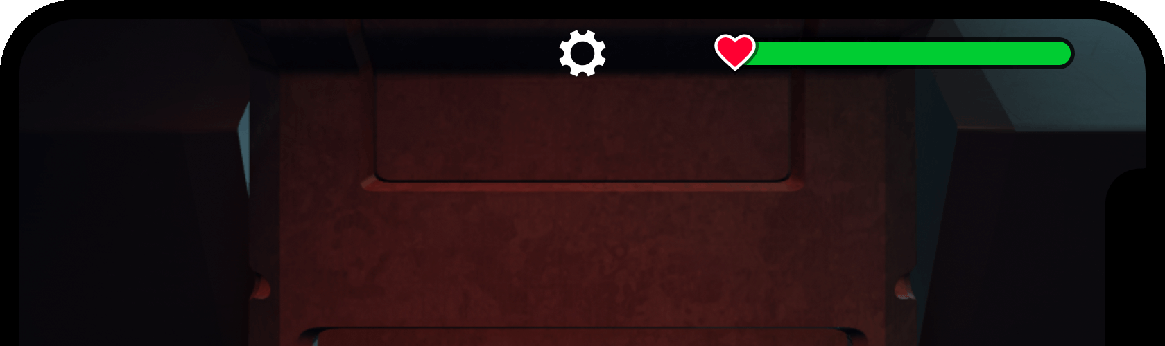
GuiButtons are interactive user interface elements with built‑in functionality such as the multi‑platform Activated event which fires when the button is clicked or tapped. The GuiButton class extends to two variations, TextButton and ImageButton, and this tutorial uses a "gear" shaped ImageButton to toggle the settings menu open or closed.
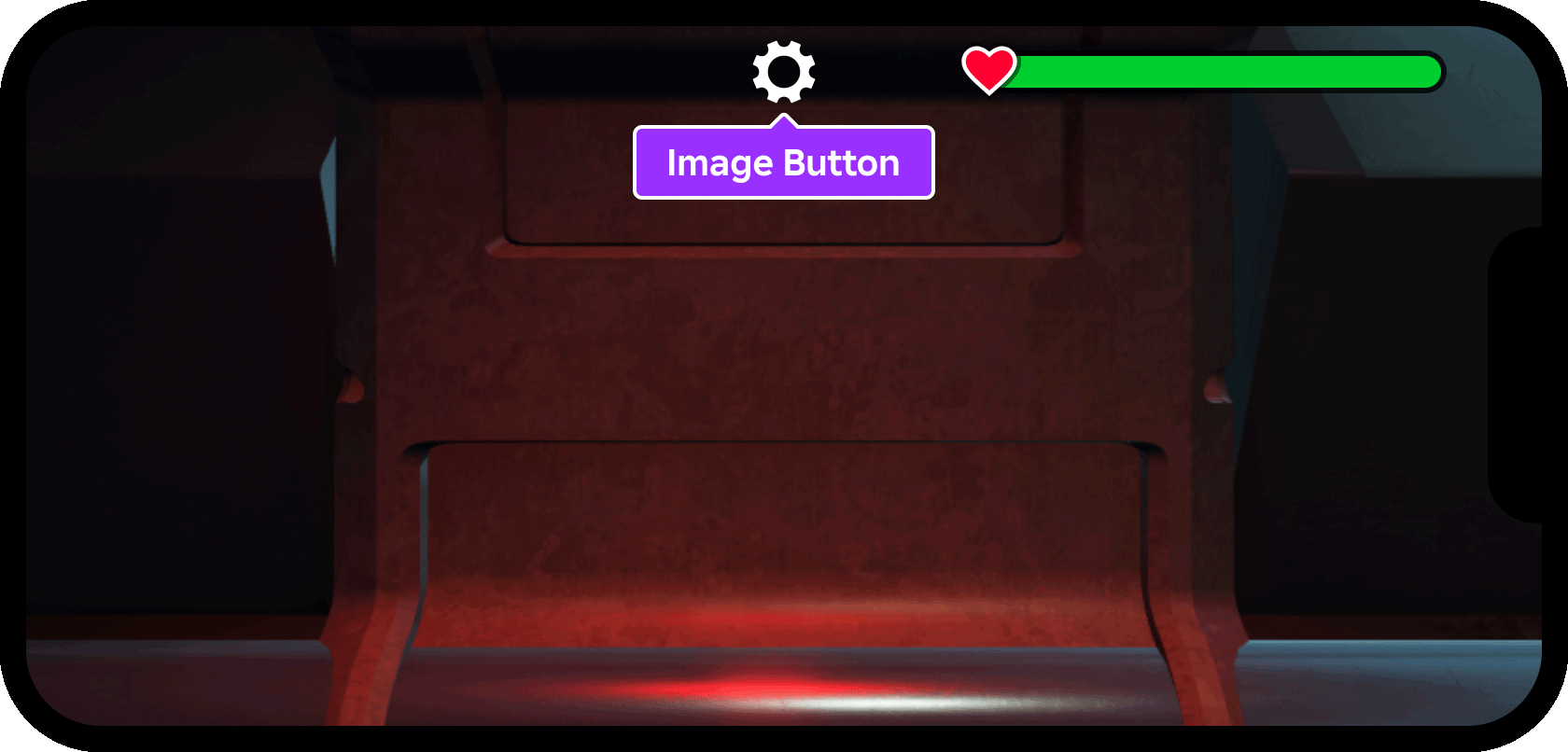
To construct the settings button:
In the Explorer window, locate HUDContainer inside
StarterGui.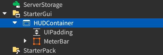
Insert an
ImageButtoninto HUDContainer and rename it to SettingsButton.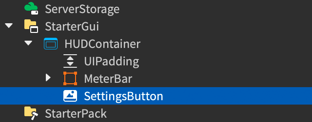
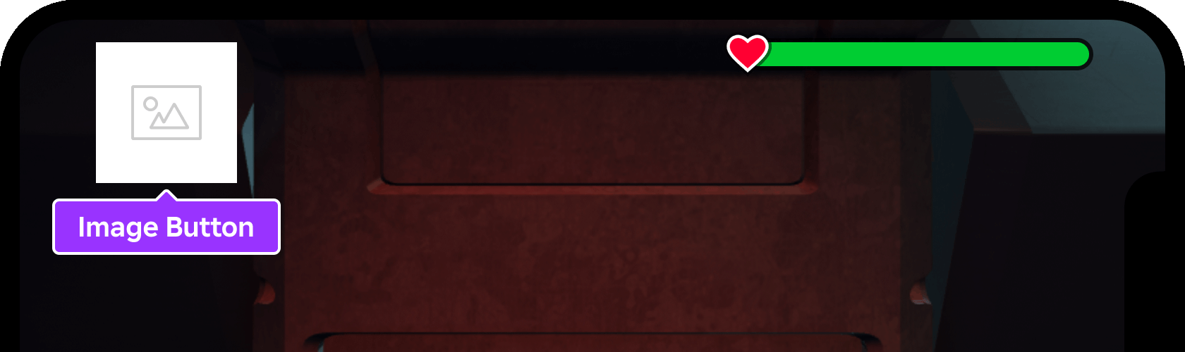
With the new button selected, set the following in the Properties window:
AnchorPoint=0.5, 0.25(horizontal center and vertical upper quarter)BackgroundTransparency=1(fully transparent)Position=0.5, 0, 0, 0(top-center positioning)Size=0.1, 0, 0.1, 0(10% of screen height once aspect ratio is constrained)Image=rbxassetid://104919049969988(asset ID of "gear" symbol)
Insert a
UIAspectRatioConstraintinto the button with default properties (1:1 width to height).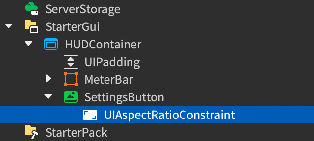
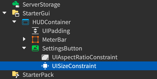
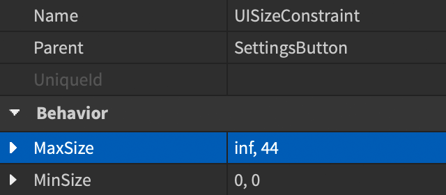
To limit the button's maximum pixel height, insert a
UISizeConstraintand set itsMaxSizetoinf, 44.
Create the settings menu#
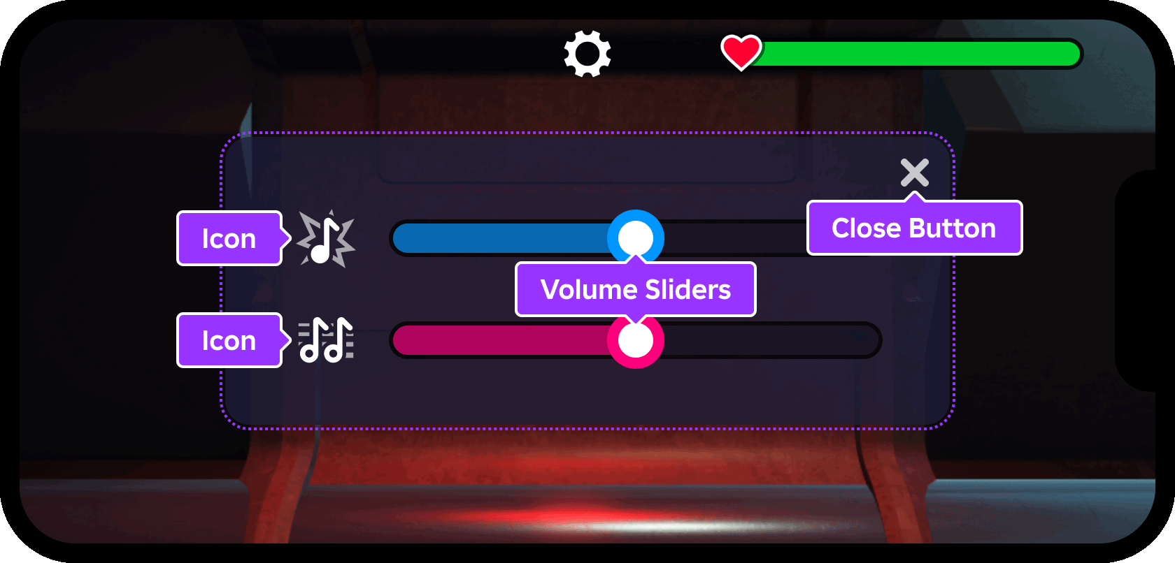
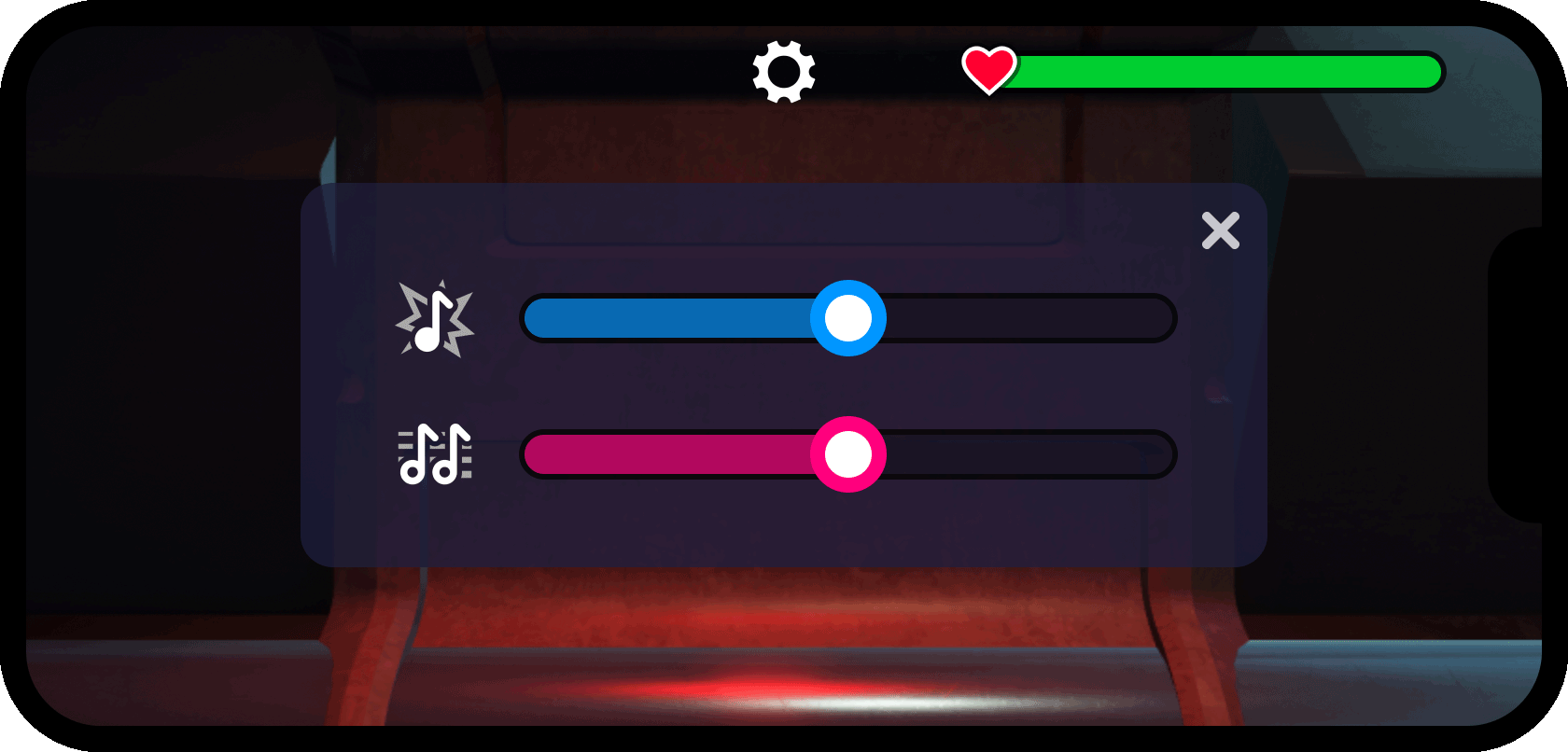
The new settings button will be scripted to toggle a settings menu open and closed, giving players on‑demand access to settings or other information. In this tutorial, the menu will contain interactive sliders to adjust the volume levels of background audio and sound effects independently.
Create the parent frame#
As noted in Create HUD meters, a Frame serves as a container for other UI objects. The entire settings menu will be constructed with a single parent frame, making it simple to manage as a stateful object that reacts to input differently depending on the current state.
Insert a
Frameinto HUDContainer and rename it SettingsMenu.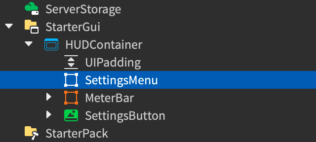
With SettingsMenu selected, set the following properties:
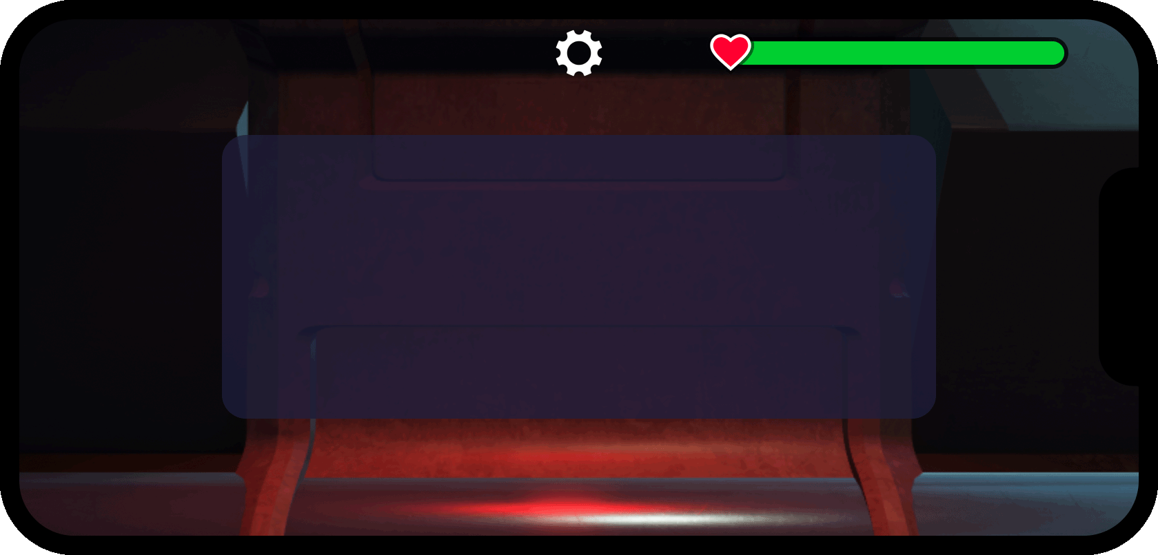
AnchorPoint=0.5(center anchor)BackgroundColor3=30, 30, 60(navy blue)BackgroundTransparency=0.25(75% opaque)Position=0.5, 0, 0.5, 0(center of screen)Size=0.75, 0, 0.75, 0(75% width/height of the inset screen area)
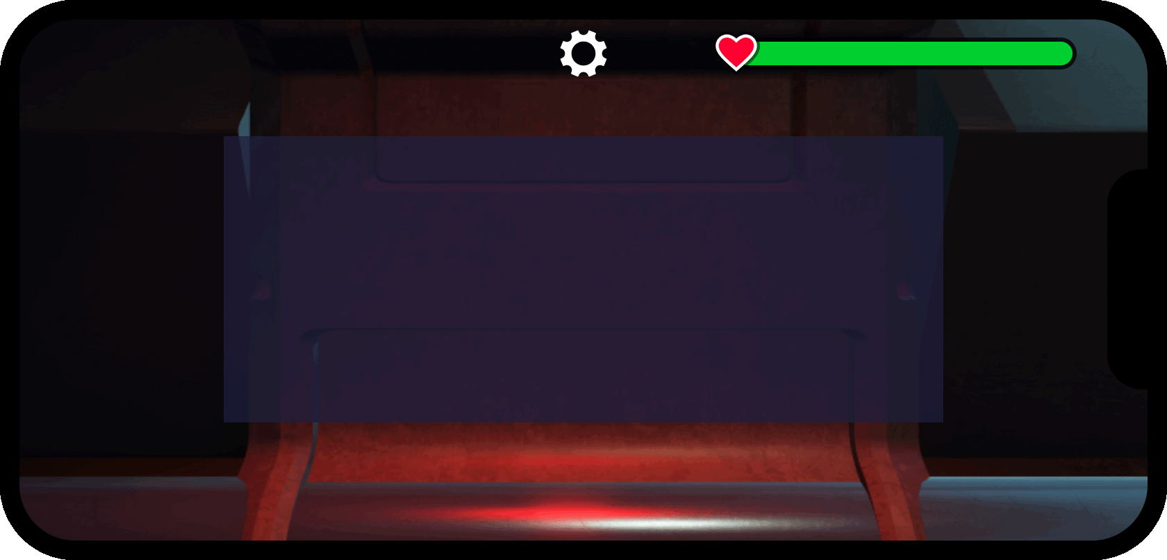
Insert a
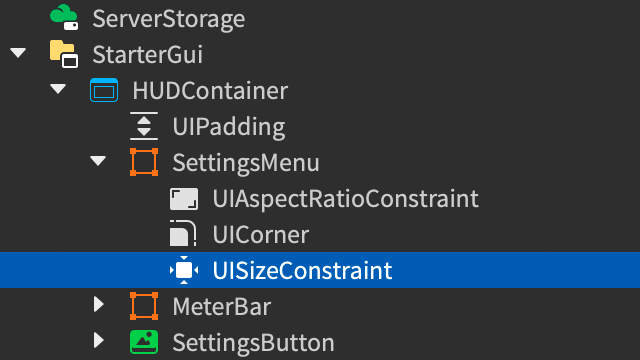
UIAspectRatioConstraintinto SettingsMenu and set itsAspectRatioproperty to2.5. (2.5:1 width to height).
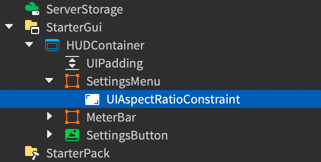
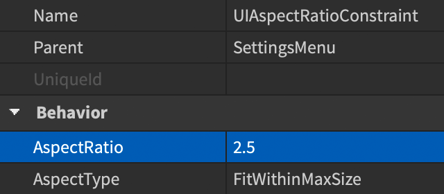
- Insert a
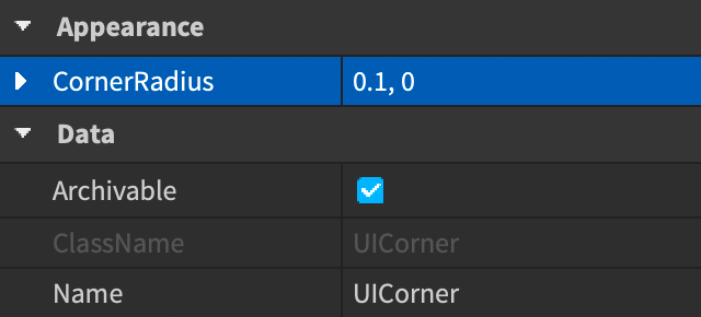
UICornermodifier into SettingsMenu and set itsCornerRadiusto0.1, 0.
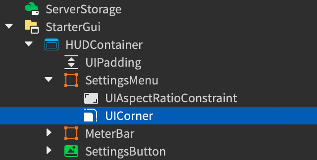
- To constrain the pixel width and height of SettingsMenu, insert a
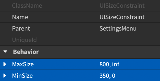
UISizeConstraint. Set itsMaxSizeto800, infand itsMinSizeto350, 0.
Construct a slider#
To allow players to adjust volume levels, the settings menu will contain two draggable slider widgets powered by UIDragDetector, a convenient object that facilitates interaction with 2D user interface elements.
To create a parent container for the first slider:
Insert a new
Frameinto the SettingsMenu container and rename it EffectsVolumeSlider.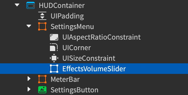
With the EffectsVolumeSlider frame selected, set the following properties:
AnchorPoint=0.5(center anchor)BackgroundTransparency=1(fully transparent)Position=0.5, 0, 0.35, 0(horizontal center and 35% from container's top)Size=0.8, 0, 0.1, 0(80% of container's width and 10% of its height)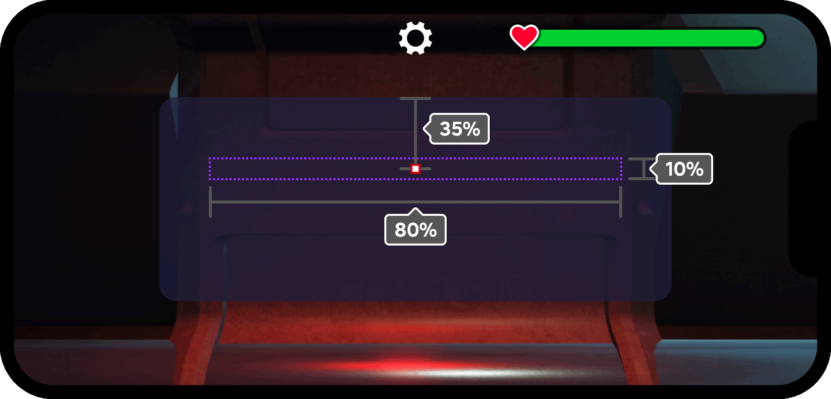
Insert a new
UIListLayoutinto EffectsVolumeSlider. This layout modifier is a powerful way to auto‑arrange siblingGuiObjectsinto horizontal rows or vertical columns within their parent container, including the ability to apply flex concepts.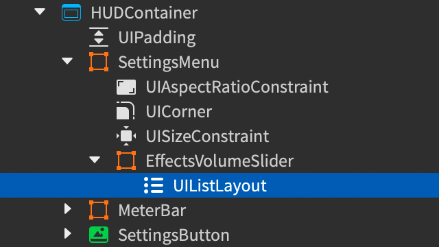
Set the following properties for the new
UIListLayout:Padding=0.06, 0(6% padding between list elements)FillDirection=Horizontal(left-to-right arrangement of elements)HorizontalFlex=Fill(resize elements horizontally to fill the entire parent container, overriding their defined width)VerticalAlignment=Center(align elements along their vertical center)
Slider icon#
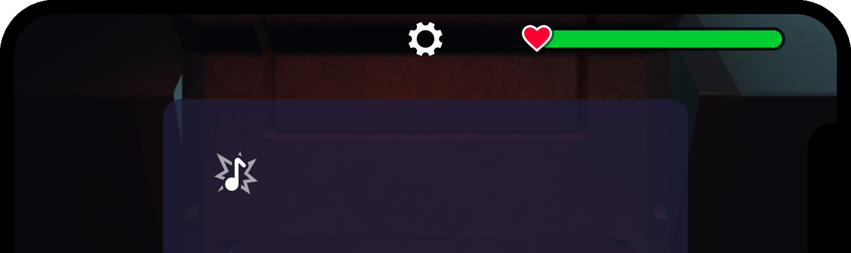
A simple icon including an audio note and "burst" symbol helps players identify the slider's purpose when they open the settings menu.
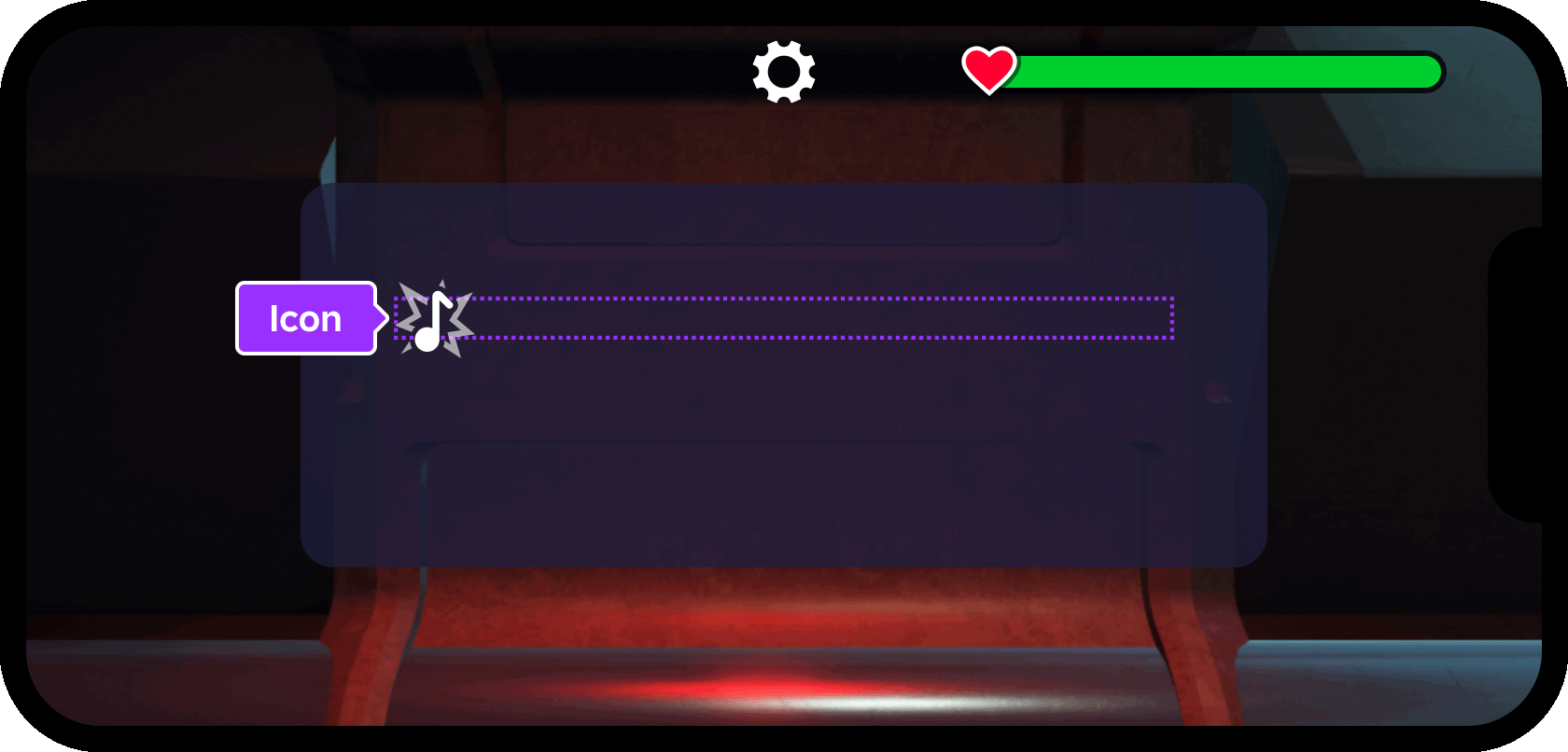
Insert an
ImageLabelinto the EffectsVolumeSlider frame and rename it to Icon. This icon will help players understand what game aspect the slider controls.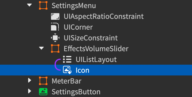
Importantly, note that the label must be a sibling of the UIListLayout, not a child of it.
With Icon selected, set the following properties:
BackgroundTransparency=1(fully transparent)Size=2.5, 0, 2.5, 0(250% height of parent frame once aspect ratio is constrained)Image=rbxassetid://90019827067389(asset ID of audio note and "burst" symbol)
Insert a
UIAspectRatioConstraintinto Icon and leave its properties as the defaults (1:1 width to height).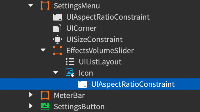
Range frame#
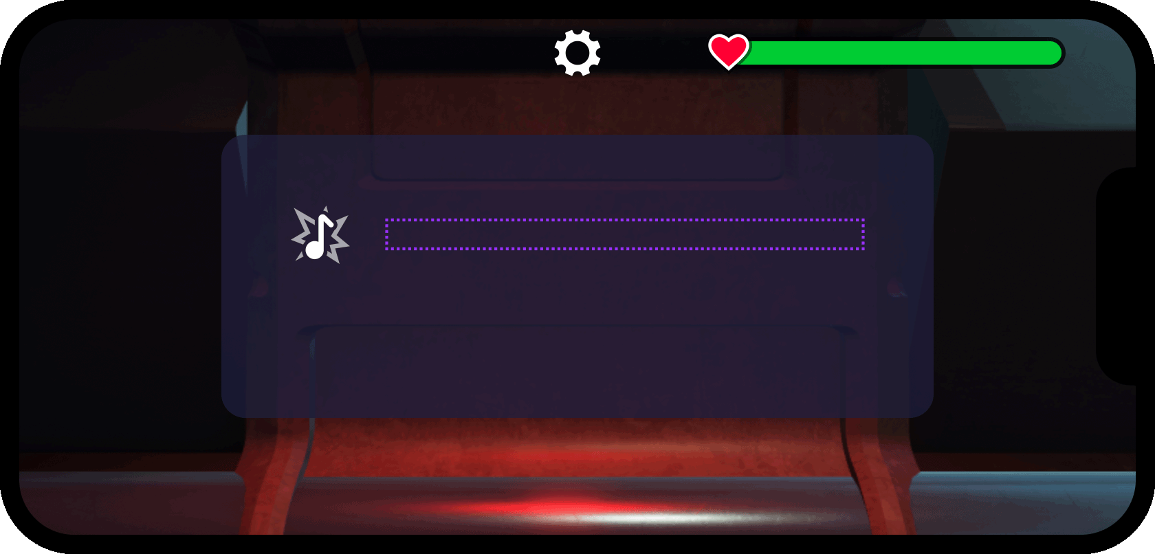
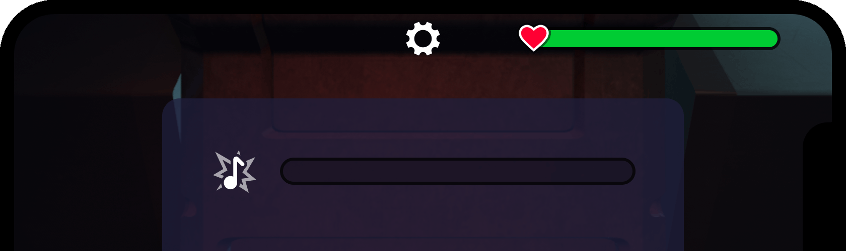
Directly to the right of the icon, the interactive portion of the slider should be contained within another Frame.
Insert a new
Frameinto the EffectsVolumeSlider frame and rename it SliderFrame. Note that it must be a direct sibling of theUIListLayoutlayout modifier.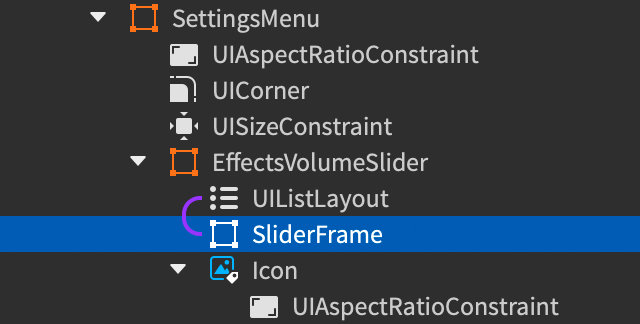
With SliderFrame selected, set the following properties:
BackgroundColor3=0(black)BackgroundTransparency=0.75(25% opaque)LayoutOrder=1Size=1, 0, 1, 0(100% width/height of parent frame)
Note that it's not necessary to assign positional changes such as AnchorPoint or Position, as the UIListLayout controls the positioning of its siblings, in this case ordering them horizontally from left to right and keeping them vertically centered with each other.
The LayoutOrder property is important when working with layout modifiers such as UIListLayout, as it determines the sequence in which siblings are placed respective to each other. Changing it to 1 for SliderFrame ensures it's placed to the right of Icon which has a default LayoutOrder of 0.
Insert the following modifiers into SliderFrame:
UICornerwith itsCornerRadiusproperty set to0.5, 0("pill" shape)UISizeConstraintwith itsMaxSizeproperty set toinf, 30(maximum 30 pixels in height)UIStrokewith itsColorset to0,Thicknessto3, andTransparencyto0.25(75% opaque black outline)
Interactive handle#
With the slider container constructed, you can now create a draggable handle for players to interact with during gameplay.
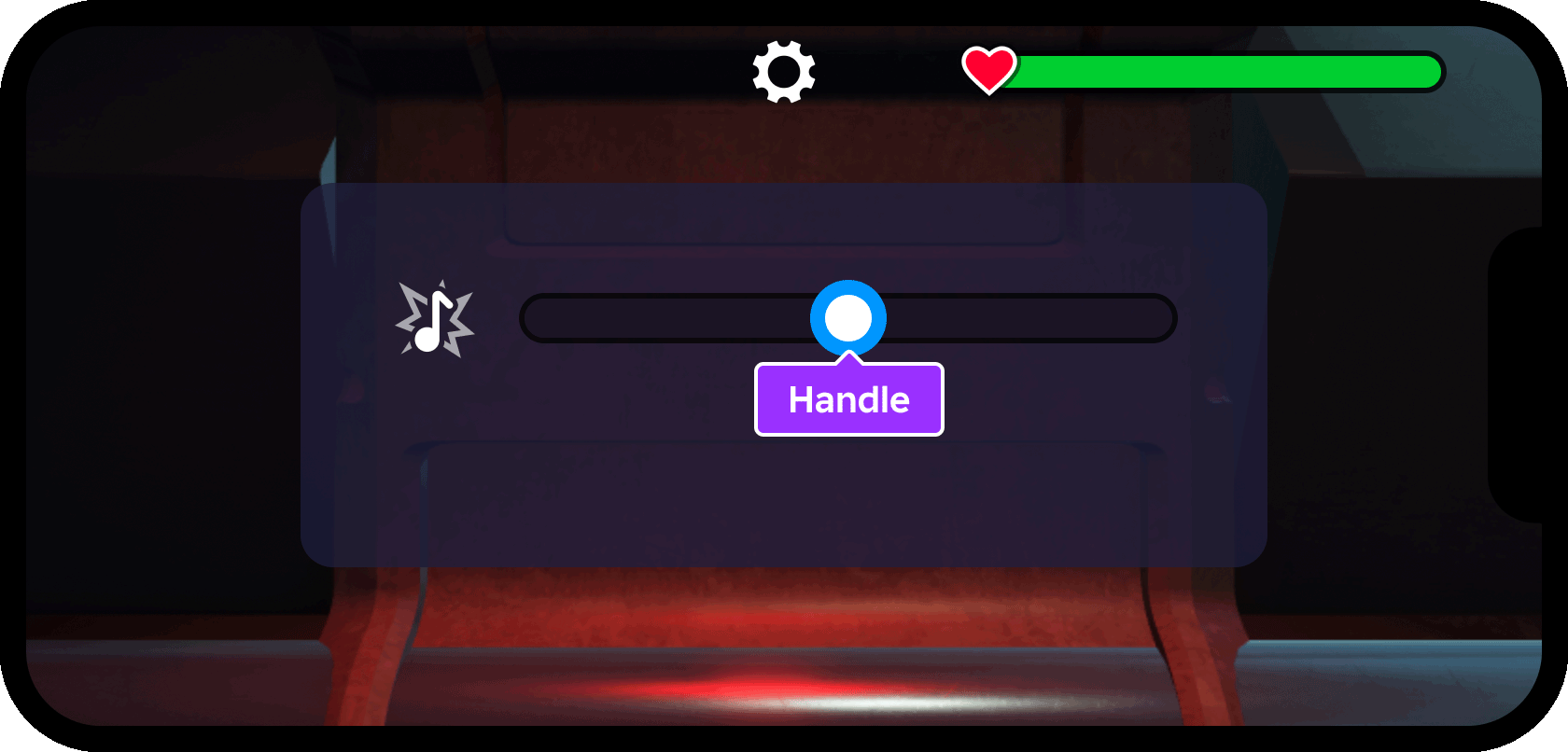
Insert a new
Frameinto the SliderFrame container and rename it to Handle.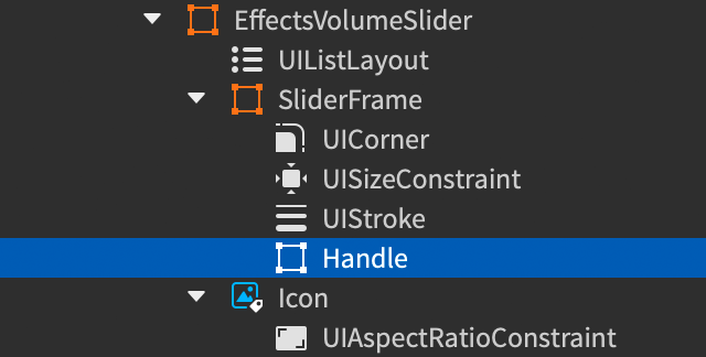
With Handle selected, set the following properties:
AnchorPoint=0.5(center anchor)Position=0.5, 0, 0.5, 0(horizontal and vertical center of parent frame)Size=1.2, 0, 1.2, 0(120% height of parent frame once aspect ratio is constrained)ZIndex=3(layer handle visually in front of other slider elements)
Insert the following modifiers into Handle:
UIAspectRatioConstraintwith its default properties (1:1 width to height)UICornerwith itsCornerRadiusproperty set to0.5, 0(circular shape)UIStrokewith itsColorset to[0, 150, 255]andThicknessto8(thick blue outline)
Insert a
UIDragDetectorobject into Handle. This convenient object facilitates and encourages interaction with 2D user interface elements.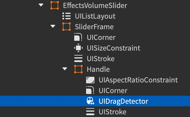
Set the following properties for the new
UIDragDetector:DragStyle=TranslateLine(1D motion along the detector'sDragAxis.)ResponseStyle=Scale(move by scale values of the detector's parent's position)
To ensure the handle's linear drag range is limited to its container, link its
BoundingUIproperty to the SliderFrame container:- Select the
UIDragDetector. - Click its
BoundingUIproperty in the Properties window. - Back in the Explorer window, click the handle's parent SliderFrame.
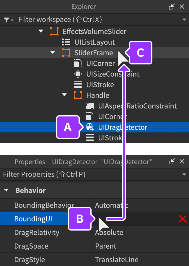
The
BoundingUIproperty link now reflects the SliderFrame container: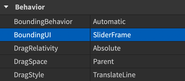
- Select the
If you playtest the game now, you'll be able to drag the handle left and right within its parent container:
Inner fill#
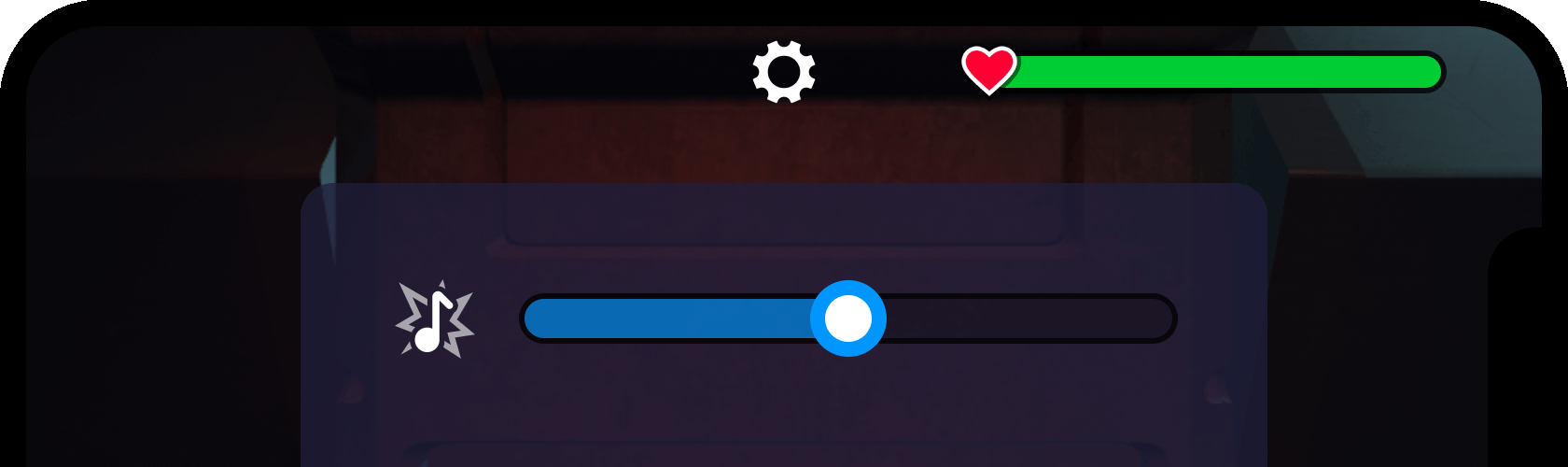
To more clearly indicate that the slider controls a 0% to 100% range, you can add an inner fill to the left side of the container which will sync with the handle's variable position.
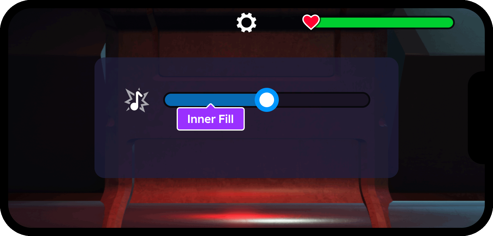
Insert a new
Frameinto the SliderFrame container and rename it to InnerFill.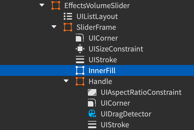
Set the following properties for the InnerFill frame:
AnchorPoint=0, 0.5(left edge and vertical center)BackgroundColor3=[0, 150, 255](blue matching the slider's handle)BackgroundTransparency=0.35(65% opaque)Position=0, 0, 0.5, 0Size=0.5, 0, 1, 0(50% width and 100% height of parent frame)ZIndex=2(layer visually in front of parent frame's fill/outline)
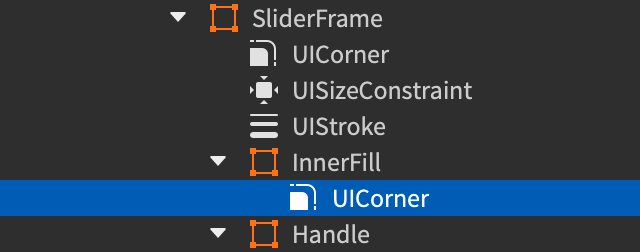
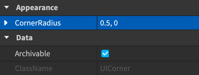
To match the "pill" shape of the parent SliderFrame container, insert a
UICornermodifier and set itsCornerRadiusproperty to0.5, 0.
Duplicate the slider#
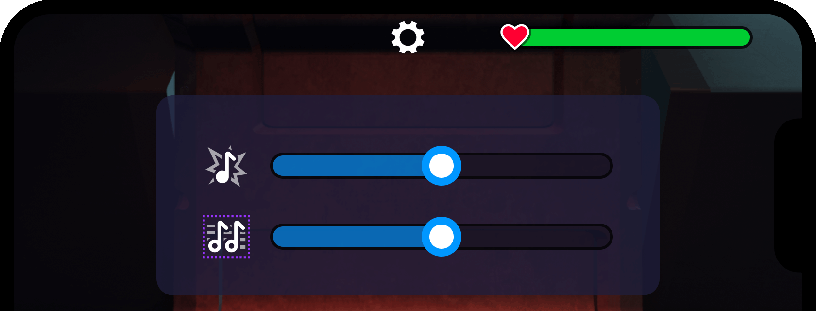
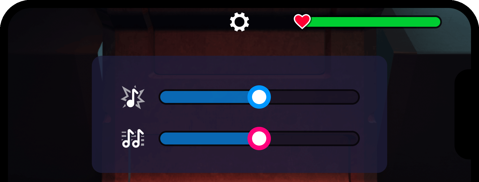
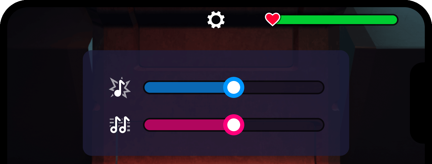
With the first slider constructed, you can easily duplicate it and modify some visual aspects to indicate another purpose, in this case the volume level of background audio symbolized by an icon of musical notes.
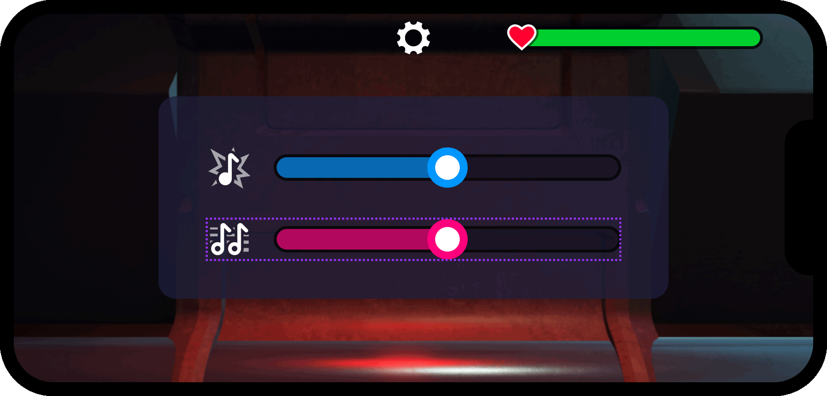
Select the completed EffectsVolumeSlider object.
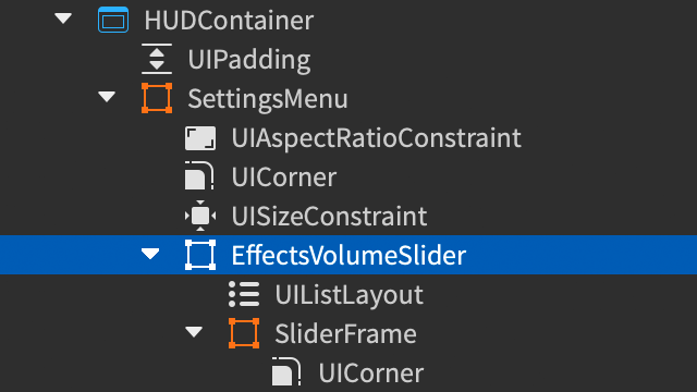
Duplicate it (CtrlD or ⌘D) and then rename the duplicate to BackgroundVolumeSlider.
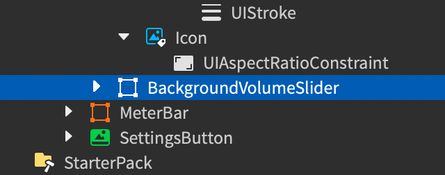
Change the duplicate's
Positionto0.5, 0, 0.7, 0to move it below the first slider.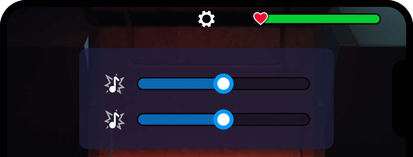
Expand the top-level branch of BackgroundVolumeSlider, select the Icon image label, and change its
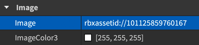
Imageproperty torbxassetid://101125859760167(asset ID of symbol with musical notes).

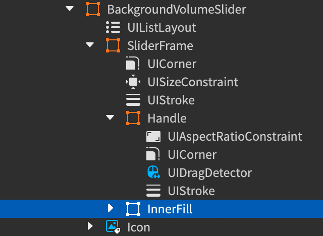
- Expand the SliderFrame ⟩ Handle branch, select the
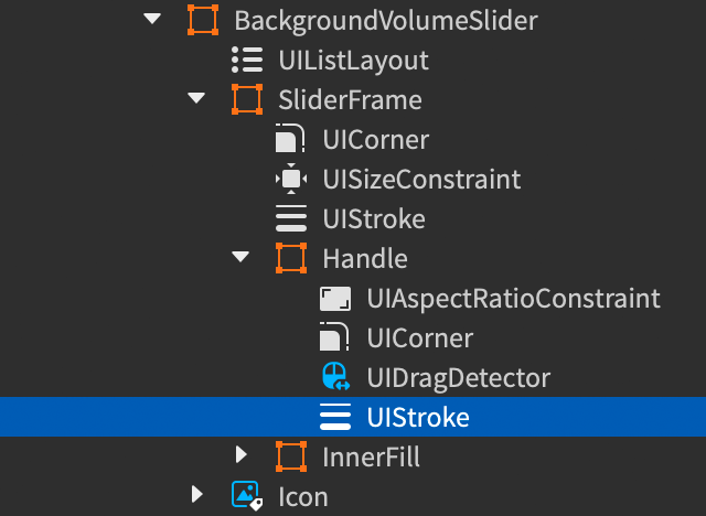
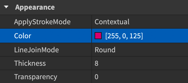
UIStrokemodifier within, and set itsColorproperty to[255, 0, 125](magenta).
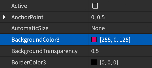
- Select the InnerFill frame within SliderFrame and change its
BackgroundColor3property to the same magenta color ([255, 0, 125]).
Create the close button#
The final element of the settings menu is a close button which provides players an additional input to close the menu (the SettingsButton in the top‑center will serve the same purpose).
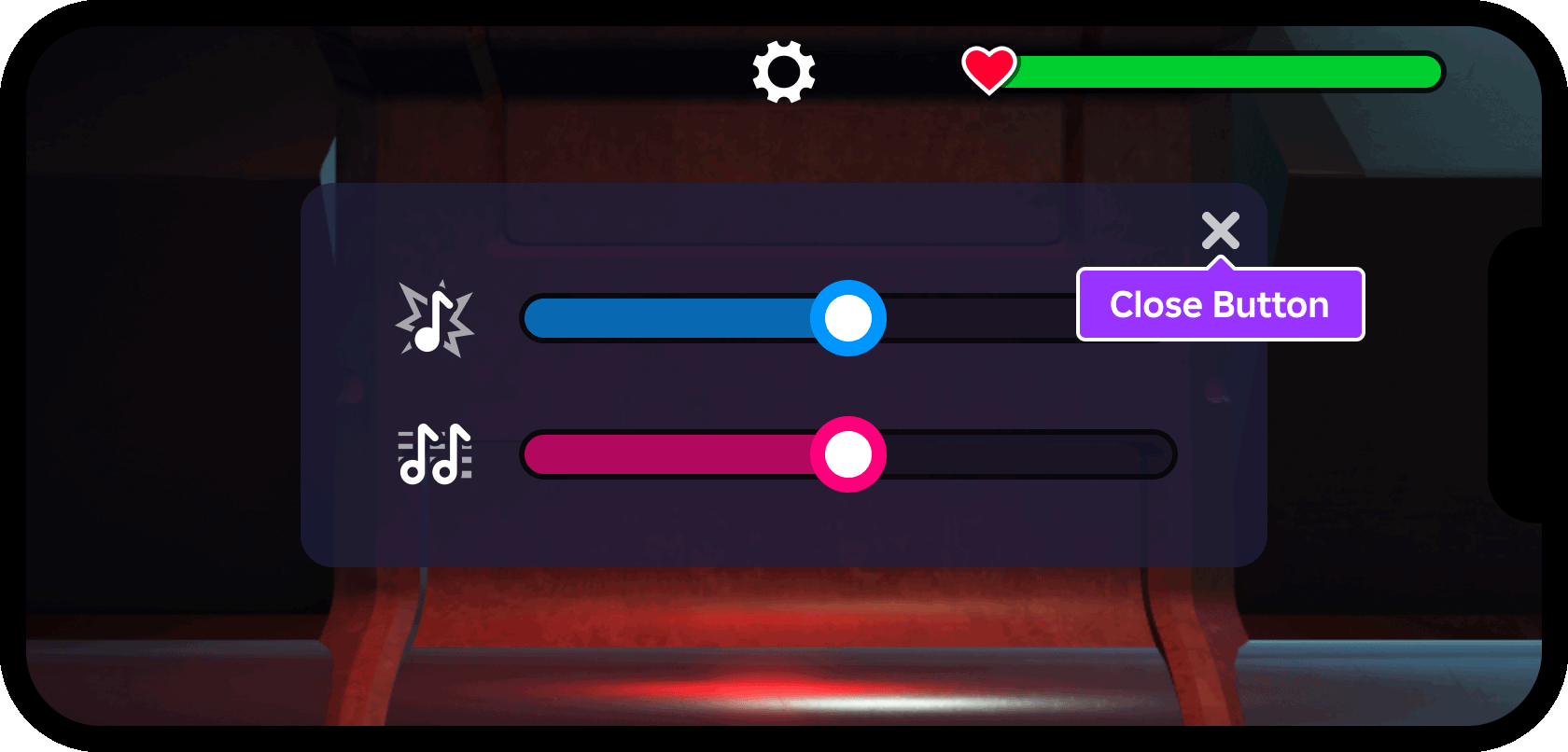
Insert a new
ImageButtoninto the SettingsMenu container and rename it CloseButton.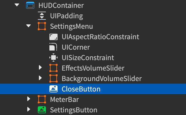
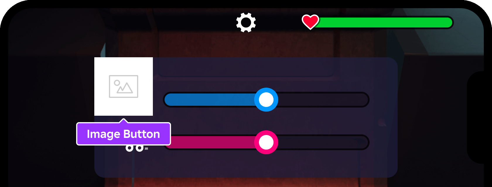
With CloseButton selected, set the following properties:
AnchorPoint=1, 0(top-right corner)BackgroundTransparency=1(fully transparent)Position=1, -10, 0, 10(10 pixel inset from top-right corner)Size=0.15, 0, 0.15, 0(15% of frame height once aspect ratio is constrained)Image=rbxassetid://5577404210(asset ID of close button symbol)ImageTransparency=0.25(75% opaque)
Insert a
UIAspectRatioConstraintinto the button with default properties (1:1 width to height).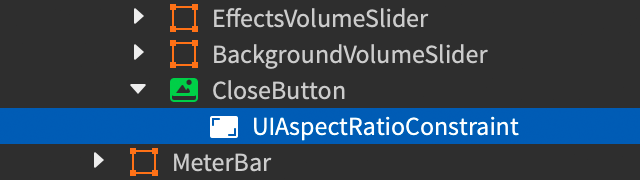
Create the control modules#
An extensible control module setup makes interactive UI management more streamlined than individual scripts placed within each object. ModuleScripts facilitate this extensible functionality by letting you reuse code between scripts on different sides of the client‑server boundary or the same side of the boundary.
Stateful object controller#
The following stateful object controller module lets you attach behavior to UI objects such as SettingsButton and SettingsMenu, and easily toggle/tween between various states. To create the module:
Insert a
ModuleScriptinto theReplicatedStoragecontainer and rename it to StatefulObjectController.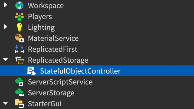
Paste the following code inside the module:
```lua title="StatefulObjectController" local TweenService = game:GetService("TweenService")
local StatefulObjectController = {} StatefulObjectController.__index = StatefulObjectController
export type StateName = string export type State = { transition: TweenInfo, properties: { [string]: any }, }
function StatefulObjectController.hydrate(props: { object: Instance, states: { [StateName]: State }, initialStateName: StateName }) local object, states, initialStateName = props.object, props.states, props.initialStateName
local self = setmetatable({ states = states, currentStateName = initialStateName, tweens = {}, }, StatefulObjectController)
-- Create tweens for reuse to avoid making new tweens every time state is changed for stateName, state in states do self.tweens[stateName] = TweenService:Create(object, state.transition, state.properties) end
self:setState(self.currentStateName)
return self end
function StatefulObjectController:setState(stateName: StateName) local stateTween: Tween = self.tweens[stateName] if not stateTween then warn(string.format("Attempted to set %s to unknown state '%s'", self.object:GetFullName(), stateName)) return end
self.currentStateName = stateName
-- Make sure other tweens aren't conflicting for _, tween in self.tweens do tween:Cancel() end
stateTween:Play() end
return StatefulObjectController ```
Code Explanation
| Lines | Purpose |
6‑10 |
Defines and exports the Luau types to improve autocomplete and linting when using this module. |
12‑33 |
Function used to initialize and attach behavior to a stateful UI object, accepting a GuiObject as object, a table of states and their respective TweenInfo data, and an initial state name. Inside this function, lines 26‑28 construct Tweens for each state, and line 30 calls the module's setState() function to set the object to the initial state. |
35‑50 |
Function used to set/change the state of a stateful object. Line 42 sets the object's currentStateName to the state being set, lines 45‑47 cancel any running tweens to prevent conflicts, and line 49 executes the state's tween(s). |
Slider controller#
An additional module initializes and controls the two volume sliders. It also allows you to connect a callback function to each slider in order to detect player interaction with the slider and apply desired changes in the game.
Insert a
ModuleScriptinto theReplicatedStoragecontainer and rename it to SliderController.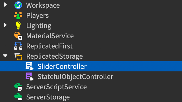
Paste the following code inside the module:
```lua title="SliderController" local SliderController = {} SliderController.__index = SliderController
export type Value = number export type -> ()
function SliderController.hydrate(props: { object: Instance, onChanged: OnChanged, initialValue: Value? }) local object, onChanged, initialValue = props.object, props.onChanged, props.initialValue
local handle = object:FindFirstChild("Handle", true) if not handle then warn(string.format("Attempted to hydrate slider %s but couldn't find Handle", object:GetFullName())) end
local innerFill = object:FindFirstChild("InnerFill", true) if not innerFill then warn(string.format("Attempted to hydrate slider %s but couldn't find InnerFill", object:GetFullName())) end
local dragDetector = handle:FindFirstChildWhichIsA("UIDragDetector") if not dragDetector then warn(string.format("Attempted to hydrate slider %s but couldn't find UIDragDetector", object:GetFullName())) end
local self = setmetatable({ handle = handle, innerFill = innerFill, dragDetector = dragDetector, value = initialValue or 0.5, }, SliderController)
-- Set initial value self:setValue(self.value)
-- Connect detector to player manipulation self.dragConnection = dragDetector.DragContinue:Connect(function() self:setValue(handle.Position.X.Scale) end)
return self end
function SliderController:setValue(value: Value) local clampedValue = math.clamp(value, 0, 1) self.value = clampedValue
-- Update the handle position and inner frame size to match self.handle.Position = UDim2.fromScale(clampedValue, 0.5) self.innerFill.Size = UDim2.fromScale(clampedValue, 1)
-- Run the user's callback with the latest value local changeSuccess, changeResult = pcall(self.onChanged, clampedValue) if not changeSuccess then warn("Error in slider callback:", changeResult) end end
return SliderController ```
Code Explanation
| Lines | Purpose |
7‑46 |
Function used to initialize and attach behavior to a slider element, accepting the slider's parent Frame as object, an onChanged callback function to process slider changes, and an initial value for the slider's handle position. Inside the function, lines 14‑27 confirm that the slider's handle, inner fill, and UIDragDetector elements exist. Line 38 calls the module's setValue() function and lines 41‑43 connect the drag detector's DragContinue event to the module's setValue() function (see next row for details). |
48‑61 |
Function used to set the value of the slider. Inside the function, lines 53‑54 ensure the handle's position and inner fill size are synced, and line 57 passes the changed value to the callback function so that you can utilize the value as needed. |
Create the settings script#
With the settings button and settings menu finalized, you can hook everything together with a single script that utilizes the control modules.
Insert a new
LocalScriptinto HUDContainer and rename it to SettingsScript to describe its purpose. Note that this script should be at the same level (sibling) as SettingsMenu and SettingsButton, the top‑level UI objects it will manage.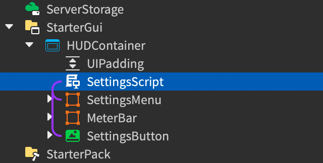
Paste the following code inside the script:
```lua title="SettingsScript" local ReplicatedStorage = game:GetService("ReplicatedStorage") local SoundService = game:GetService("SoundService")
local SliderController = require(ReplicatedStorage.SliderController) local StatefulObjectController = require(ReplicatedStorage.StatefulObjectController)
local HUDContainer = script.Parent
-- Initialize settings button local settingsButton = StatefulObjectController.hydrate({ object = HUDContainer:FindFirstChild("SettingsButton"), states = { menuOpen = { transition = TweenInfo.new(0.5, Enum.EasingStyle.Exponential, Enum.EasingDirection.Out), properties = { Rotation = 45, }, }, menuClosed = { transition = TweenInfo.new(0.5, Enum.EasingStyle.Exponential, Enum.EasingDirection.Out), properties = { Rotation = 0, }, }, }, initialStateName = "menuClosed" })
-- Initialize settings menu frame local settingsMenu = StatefulObjectController.hydrate({ object = HUDContainer:FindFirstChild("SettingsMenu"), states = { menuOpen = { transition = TweenInfo.new(0.5, Enum.EasingStyle.Bounce, Enum.EasingDirection.Out), properties = { Position = UDim2.fromScale(0.5, 0.5), Visible = true, }, }, menuClosed = { transition = TweenInfo.new(0), properties = { Position = UDim2.fromScale(0.5, 0.4), Visible = false, }, }, }, initialStateName = "menuClosed" })
-- Initialize effects volume slider local effectsAudio = SoundService:FindFirstChild("Effects") local effectsVolumeSlider = SliderController.hydrate({ object = HUDContainer:FindFirstChild("EffectsVolumeSlider", true), initialValue = effectsAudio and effectsAudio.Volume or 0.5, SliderController.Value) if effectsAudio then effectsAudio.Volume = value end end, })
-- Initialize background volume slider local backgroundAudio = SoundService:FindFirstChild("Background") local backgroundVolumeSlider = SliderController.hydrate({ object = HUDContainer:FindFirstChild("BackgroundVolumeSlider", true), initialValue = backgroundAudio and backgroundAudio.Volume or 0.5, SliderController.Value) if backgroundAudio then backgroundAudio.Volume = value end end, })
-- Connect buttons to player interaction HUDContainer:FindFirstChild("SettingsButton").Activated:Connect(function() local targetState = if settingsButton.currentStateName == "menuClosed" then "menuOpen" else "menuClosed" settingsButton:setState(targetState) settingsMenu:setState(targetState) end) HUDContainer:FindFirstChild("CloseButton", true).Activated:Connect(function() settingsButton:setState("menuClosed") settingsMenu:setState("menuClosed") end) ```
Reference the following sections to explore how the script utilizes the control modules.
Settings Button
Lines 10-27 initialize and attach behavior to the settings button as follows:
| Lines | Purpose |
10‑11 |
A local reference settingsButton is declared and hydrated with the StatefulObjectController.hydrate() function, and the SettingsButton button within HUDContainer is referenced as the object to hydrate. |
12‑25 |
A states table is passed with two unique states, menuOpen and menuClosed. Each state contains a transition to declare (through a TweenInfo) how the particular state will reach its target properties defined in the properties table. In this case, menuOpen declares a state change to 45° for the button's Rotation with an Exponential tween of ½ second, while menuClosed effectively restores the button to its default rotation of 0. |
26 |
The button's initial state is set to menuClosed (this could be set to any state name within the states table). |
Further down in the script (lines 76-86), buttons are connected to player interaction to trigger UI state changes:
| Lines | Purpose |
76‑82 |
SettingsButton is connected to the Activated event of the GuiButton class to call an anonymous function. Inside the anonymous function, lines 77‑79 toggle a targetState variable between menuOpen and menuClosed. Line 80 then calls setState() to set the button's state to targetState and line 81 does the same to SettingsMenu so that it toggles open or closed with activation of SettingsButton. |
83‑86 |
CloseButton is connected to the Activated event to call an anonymous function which sets the state of both SettingsButton and SettingsMenu to menuClosed. |
Settings Menu
Lines 30-49 initialize and attach behavior to the settings menu as follows:
| Lines | Purpose |
30‑31 |
A local reference settingsMenu is declared and hydrated with the StatefulObjectController.hydrate() function and the SettingsMenu frame within HUDContainer is referenced as the object to hydrate. |
32‑46 |
Similar to the settings button, a states table is passed with two unique states, menuOpen and menuClosed. Here, menuOpen declares a state change to Datatype.UDim2.fromScale(0.5, 0.5) for the frame's Position with a Bounce tween of ½ second, as well as a Visible state of true. In contrast, menuClosed declares a positional state change to Datatype.UDim2.fromScale(0.5, 0.4) and Visible to false, but the TweenInfo with 0 duration on line 41 effectively makes the state change occur instantly. |
48 |
The frame's initial state is set to menuClosed. |
Further down in the script (lines 76-86), the settings menu is linked to player interaction:
| Lines | Purpose |
81 |
Sets the same targetState for SettingsMenu to sync with activation of SettingsButton. |
85 |
Sets the state of SettingsMenu to menuClosed when CloseButton is activated. |
Volume Sliders
Lines 51-73 initialize and attach behavior to EffectsVolumeSlider and BackgroundVolumeSlider as follows:
| Lines | Purpose |
52 |
Sets a local reference to the Effects SoundGroup within SoundService. A SoundGroup lets you interrelate multiple Sounds and control the volume of every sound in the group through the group's Volume property. |
53‑54 |
A local reference effectsVolumeSlider is declared and hydrated with the SliderController.hydrate() function and the EffectsVolumeSlider frame within HUDContainer ⟩ SettingsMenu is referenced as the object to hydrate. Note that the second parameter of true for FindFirstChild() tells the method to look recursively down the HUDContainer branch to locate EffectsVolumeSlider. |
55 |
The slider's initial value is set to the current Volume of the Effects sound group, or 0.5 as a fallback. |
56‑60 |
Establishes the callback function to apply slider value changes to the volume of the Effects sound group. |
64‑73 |
Essentially the same as lines 52-61, except to hydrate the BackgroundVolumeSlider frame within HUDContainer ⟩ SettingsMenu and apply slider value changes to the volume of the Background sound group. |
With SettingsScript in place, the game now offers a fully operational interactive UI example that links a related set of UI objects to player interaction.
If your interactive UI doesn't match the appearance or behavior displayed in this tutorial, remember that you can inspect UI Fundamentals - Interactivity as a completed reference template.