Profile Card
The Profile Card module lets players see more information about other players in a game.
It can be interesting to learn about other players. The ProfileCard developer module is a great way to see more information about others within a game, from badges achieved to the player's favorite games.
Module usage#
Installation#
To use the ProfileCard module in a game:
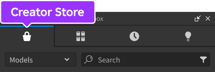
From Studio's Window menu or Home tab toolbar, open the Toolbox and select the Creator Store tab.
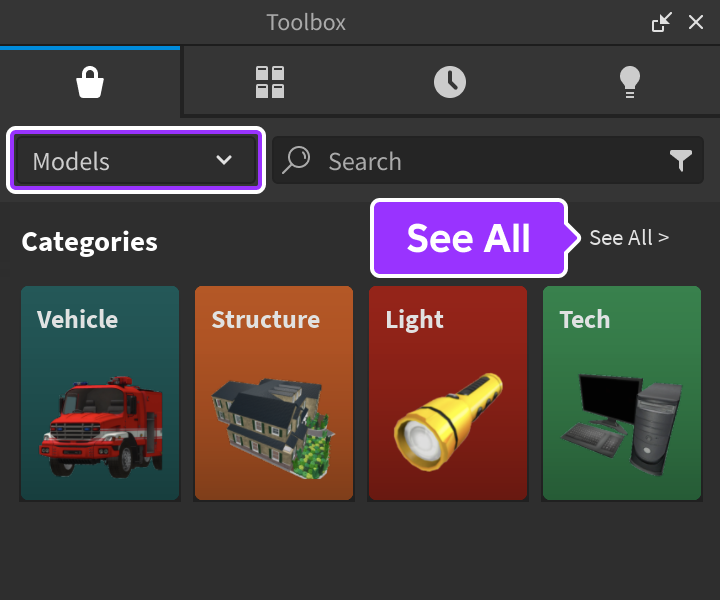
Make sure the Models sorting is selected, then click the See All button for Categories.
Locate and click the Packages tile.
Locate the Profile Card module and click it, or drag-and-drop it into the 3D view.

In the Explorer window, move the entire ProfileCard model into
ReplicatedStorage. Upon running the game the module will begin running.
Views#
Profile cards have different views depending on whether you're viewing your own card or another player's card.
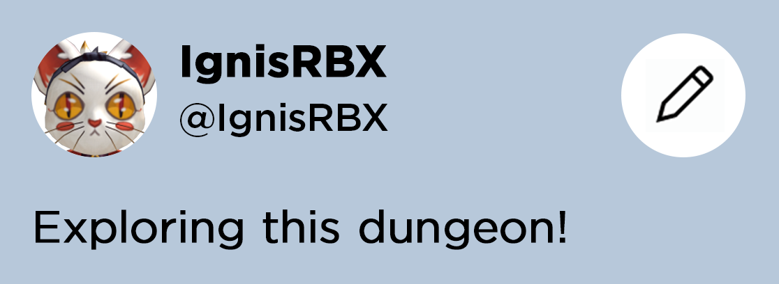
Your Card
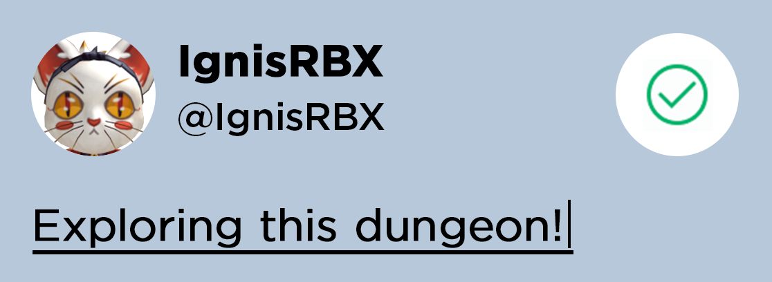
When you first spawn into the game, an icon appears over your character. Clicking the icon opens the profile card view. Once the card is closed, the icon disappears, but you can reopen the card at any time by clicking your character.
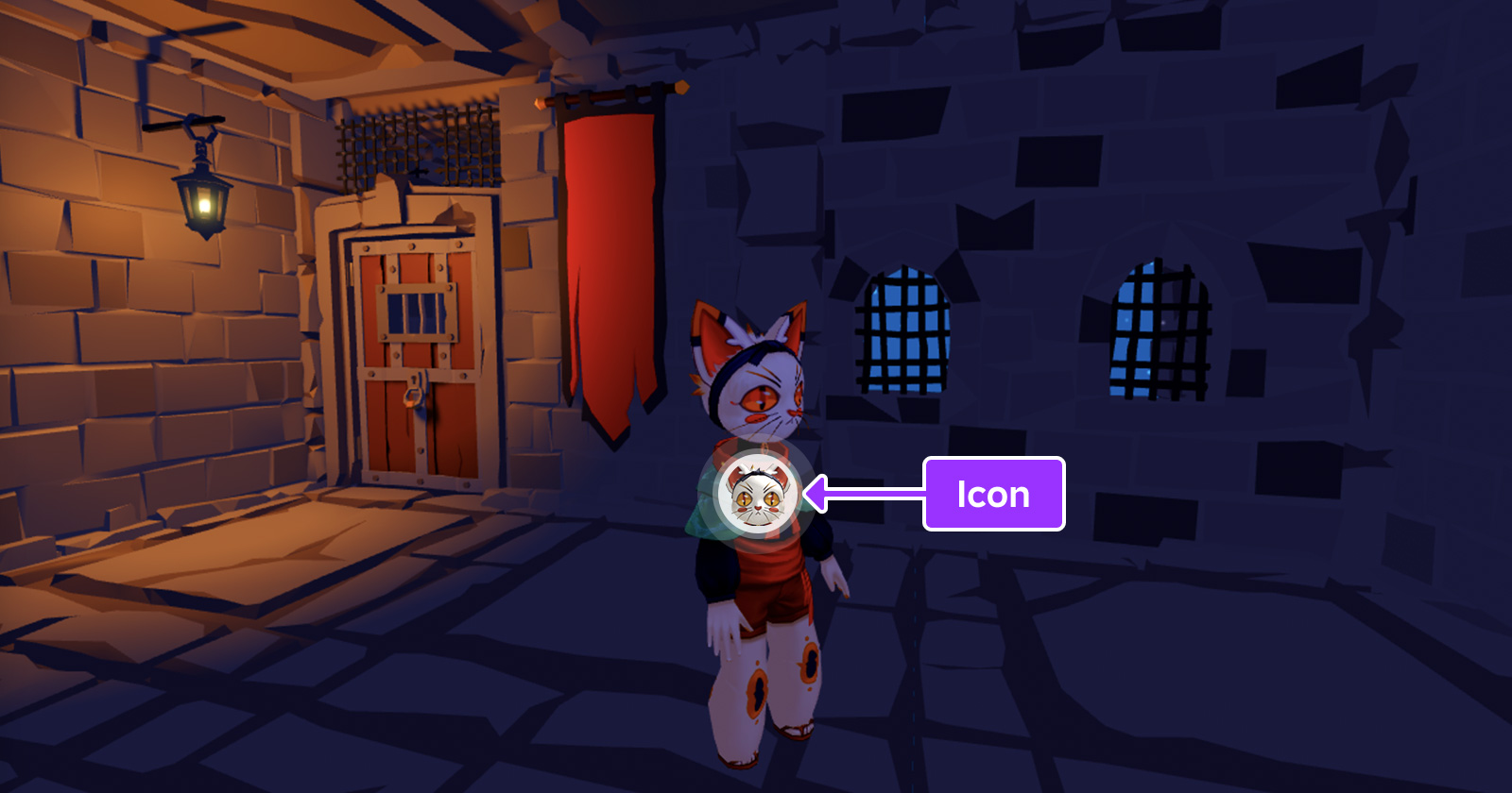
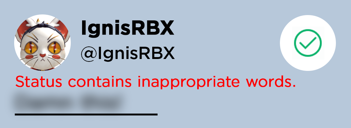
When viewing your own card, it appears as it would to another player, except placeholder text will appear for any blank inputs. Additionally, the status string is subject to text filtering, as any free text input should be.
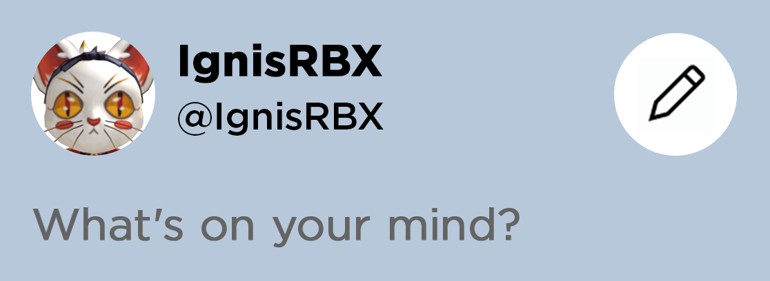
Other Player's Card
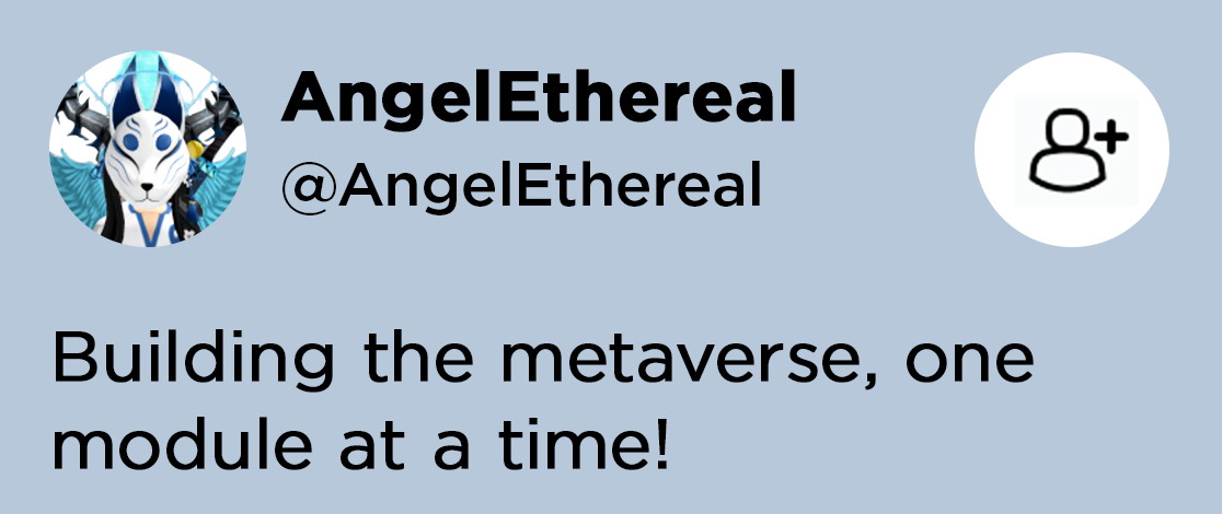
Icons do not appear over other characters, but clicking on a character will open their profile card. The button in the upper-right corner of the card lets you quickly request that player as a friend.
Note that players under the age of 13 will only see the status message if it's appropriate for their age group.

API reference#
Functions#
configure#
table)
Overrides default configuration options through the following keys/values in the config table. This function should be called from a LocalScript within StarterPlayerScripts.
| Key | Description | Default |
|---|---|---|
alwaysOnTop |
If true, shows locator icons on top of everything, preventing them from being blocked by 3D world objects. |
true |
showPersonalIndicator |
If true, shows the personal indicator when a player first joins the game. |
true |
showBlur |
If true, shows the blurry screen background when a player enters edit mode. |
true |
maxClickDistance |
Maximum distance from the camera viewpoint a card will appear when a character is clicked, measured in studs. | 100 |
backgroundColor |
Background color for the card (Color3). |
[228, 255, 255] |
backgroundTransparency |
Transparency of the card's backgroundColor. |
0.2 |
isScaled |
If true, automatically scales the size of the text to fill the height of the space. |
false |
isTruncated |
If true, automatically hides the ends of strings that would otherwise be too long for proper viewing. |
true |
hasRoundedCorners |
If true, the card's corners will be rounded. |
false |
cornerRadiusValue |
Value of the UICorner corner radius, if hasRoundedCorners is true. |
20 |
hasBorder |
If true, shows a border for the card. |
false |
borderColor |
Color of the card's border (Color3). Only applies if hasBorder is true. |
[228, 255, 255] |
borderThickness |
Thickness of the card's border, if hasBorder is true. |
3 |
borderTransparency |
Transparency of the card's border, if hasBorder is true. |
0 |
borderLineJoinMode |
Corner style of the card's border (LineJoinMode). Only applies if hasBorder is true. |
Round |
headerFontSize |
Font size for the card's header. | 18 |
headerFontType |
Font type for the card's header (Font). |
GothamBlack |
textFontSize |
Font size for the card's body text. | 15 |
textFontType |
Font type for the card's body text (Font). |
GothamMedium |
local ReplicatedStorage = game:GetService("ReplicatedStorage")

local ProfileCard = require(ReplicatedStorage.ProfileCard)

ProfileCard.configure({
	alwaysOnTop = true,
	maxClickDistance = 50,
	backgroundColor = Color3.fromRGB(0, 0, 0),
	backgroundTransparency = 0.4
})