Grid and table layouts
How to use grid and table layouts for highly structured user interfaces.
In comparison to UIListLayout, UIGridLayout and UITableLayout allow for more structured and organized layouts. These are most appropriate for interfaces like a shop inventory where each item can be presented in a grid of equally‑sized tiles, or items can be sorted into related rows/columns.
Grid layout#
UIGridLayout positions sibling GuiObjects in a grid of uniform cells of the same size within their parent container. Cells are added by row or column based on the layout's FillDirection until the next cell doesn't fit, then a new row or column begins. For further control, you can use the FillDirectionMaxCells property to set the maximum number of cells per row or column.
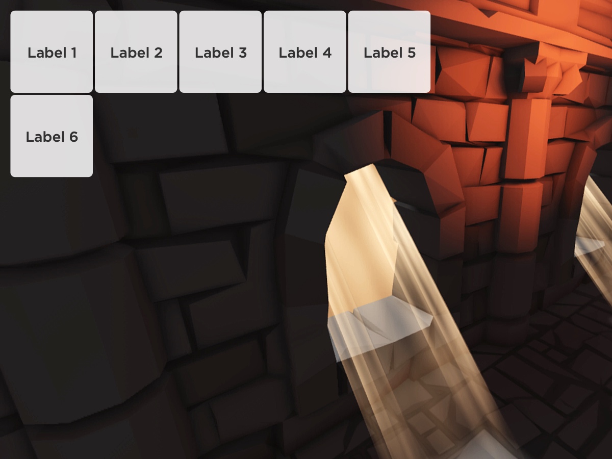
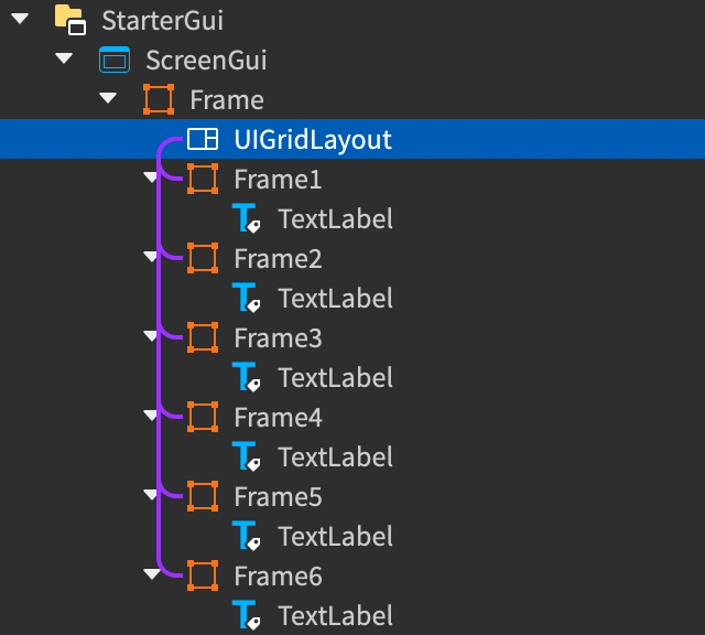
By default, UIGridLayout positions sibling GuiObjects in order of their LayoutOrder where lower values go before higher values, and equal values sort depending on the order in which you added them. If you change the layout's SortOrder to SortOrder.Name, siblings sort in alphabetical order.
Once you insert a UIGridLayout, it either overrides or influences the Position and/or Size of all sibling UI objects, so changes to those properties within the Properties window or within a script will not have the normal effect.
UIGridLayout respects any constraints you place on objects within the grid. For example, if an object has a UISizeConstraint with a MinSize property that is higher than the grid's CellSize property, the object will span multiple cells.
Table layout#
UITableLayout positions sibling GuiObjects and their children into table format. The default FillDirection of Vertical means that siblings are first positioned into rows, and children of those siblings are positioned horizontally to form columns, such that each cell within a row has the same height and each cell within a column has the same width.
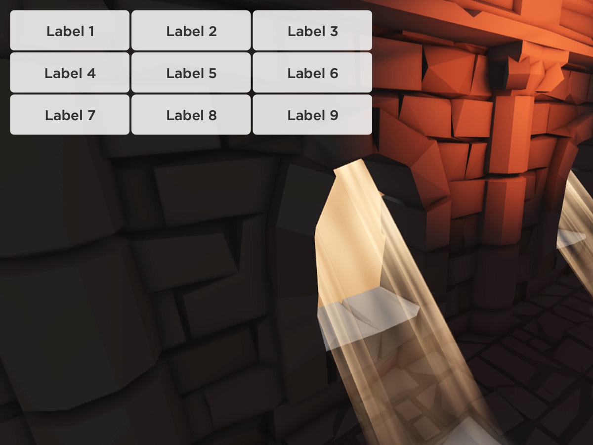
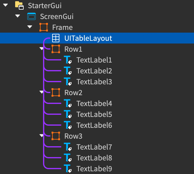
This pattern mimics the standard HTML row/column structure:
<table>
	<tbody>
		<tr> <!-- Row1 -->
			<td>Label 1</td> <!-- TextLabel1 -->
			<td>Label 2</td> <!-- TextLabel2 -->
			<td>Label 3</td> <!-- TextLabel3 -->
		</tr>
		<tr> <!-- Row2 -->
			<td>Label 4</td> <!-- TextLabel4 -->
			<td>Label 5</td> <!-- TextLabel5 -->
			<td>Label 6</td> <!-- TextLabel6 -->
		</tr>
		<tr> <!-- Row3 -->
			<td>Label 7</td> <!-- TextLabel7 -->
			<td>Label 8</td> <!-- TextLabel8 -->
			<td>Label 9</td> <!-- TextLabel9 -->
		</tr>
	</tbody>
</table>
Unless you enable the layout's FillEmptySpaceColumns or FillEmptySpaceRows properties, the size of the sibling GuiObjects determines the dimensions of the cells. For example, a TextLabel of size Datatype.UDim2.new(0.25, 0, 0.1, 0) will create a table cell of 25% width and 10% height inside the parent container.
Once you insert a UITableLayout, it either overrides or influences the Position and/or Size of all sibling UI objects, so changes to those properties within the Properties window or within a script will not have the normal effect.
UITableLayout respects and is responsive to any UISizeConstraint you place on objects within the table. For example, if an object has a UISizeConstraint with a MinSize property within a header cell, the rest of the cells within the column will be the same size as the header cell.
Note that if the MaxSize property restricts a cell's size from filling the allotted space of a row or column that is wider than the cell, the object aligns to the top‑left of the cell.